
Mix and match sheets ideas turn a plain bed into a personal design statement. A well-chosen combination of patterns, colors, and textures adds instant character to any bedroom. Sheets no longer need to match perfectly to look polished. Instead, thoughtful pairing creates a layered, curated look. This approach works for minimalist rooms and eclectic ones alike. Anyone can master it with a few simple guidelines.
Bedding trends now favor personality over uniformity. Designers mix solid sheets with printed duvets, or pair contrasting pillowcases for visual balance. Cotton, linen, and percale each bring a different texture to the mix. Warm neutrals pair well with jewel tones, while soft pastels calm a busy pattern. Additionally, seasonal swaps keep a bedroom feeling fresh year-round. This flexibility makes mixing sheets a rewarding styling skill.
The following list shares nineteen mix and match sheets ideas for every bedroom style. Each idea covers a distinct combination of color, pattern, and material. Readers can pick one approach or blend several for a custom result. From cozy neutrals to bold contrasts, these ideas suit any taste. Some pair well with a cozy bedroom styling approach, while others suit a bolder palette. Explore each section below for inspiration and practical styling tips.
In this post: 19 ideas
- Pair Solid Sheets with Patterned Duvet Covers
- Mix Stripes with Floral Prints for Playful Contrast
- Layer Different Textures for Added Depth
- Combine Neutral Tones for a Calm Base
- Add a Bold Accent Pillow for Contrast
- Mix Vintage Prints with Modern Solids
- Use a Color Wheel Approach for Coordinated Mixing
- Blend Linen Sheets with Cotton Pillowcases
- Try Tonal Layering Within One Color Family
- Mix Geometric Patterns with Organic Shapes
- Pair Warm and Cool Tones Together
- Use a Statement Duvet with Simple Sheets
- Mix Checked Patterns with Solid Pillowcases
- Layer Seasonal Textiles for Year-Round Versatility
- Combine Metallic Accents with Soft Fabrics
- Mix Boho Prints with Minimalist Bedding
- Pair Dark and Light Shades for Balance
- Use Complementary Colors for a Bedding Color Palette
- Mix Textured Throws with Printed Sheets
1. Pair Solid Sheets with Patterned Duvet Covers
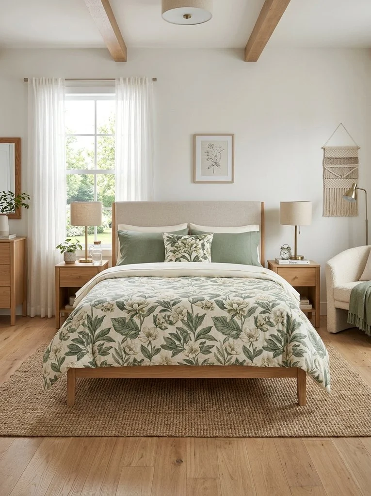
Solid sheets create a quiet base for a bolder duvet cover. This pairing highlights the pattern without overwhelming the room. Choose a duvet with florals, stripes, or abstract shapes for interest. Meanwhile, keep pillowcases in a matching solid tone for balance. This method suits beginners exploring mixing patterns bedding for the first time. It also works across most bedroom styles, from modern to traditional. As a result, the bed feels intentional rather than mismatched.
2. Mix Stripes with Floral Prints for Playful Contrast

Stripes bring structure, while florals add softness and movement. Combining both creates a lively, layered bed. However, keep the color palette consistent to avoid visual clutter. A striped fitted sheet under a floral duvet often works best. Additionally, small floral accent pillows can echo the larger print. This pairing suits cottage, coastal, and farmhouse bedrooms especially well. The contrast feels playful without looking chaotic.
3. Layer Different Textures for Added Depth
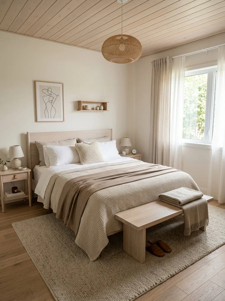
Texture matters as much as color when building layered bedding. Crisp cotton, nubby waffle weave, and smooth sateen each catch light differently. Stacking these materials adds richness even in a neutral palette. A textured throw across the foot of the bed completes the look. Meanwhile, varying weights between top and bottom sheets keeps the bed feeling curated. This idea works well in minimalist and Scandinavian interiors. Texture alone can carry a design without heavy pattern.
4. Combine Neutral Tones for a Calm Base
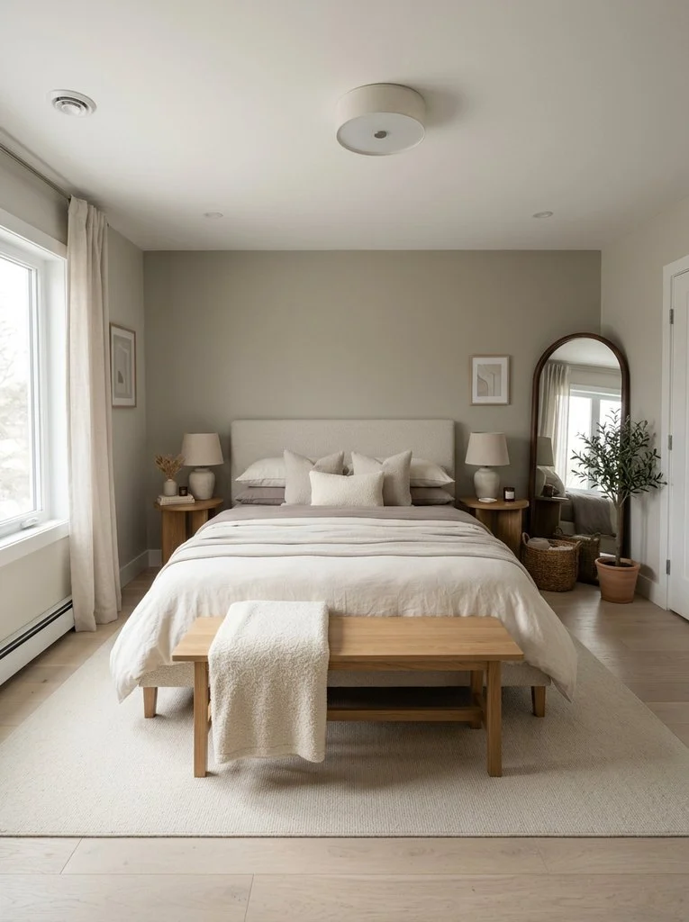
Neutral tones create a restful backdrop for subtle pattern mixing bedroom moments. Stack ivory, taupe, and soft gray sheets in slightly different shades. This tonal approach avoids harsh contrast while still adding depth. Many designers borrow ideas from two-tone bedroom palettes when building this kind of layered neutral look. A single textured throw can break up the flatness. As a result, the bed feels calm, cohesive, and elevated without much effort.
5. Add a Bold Accent Pillow for Contrast
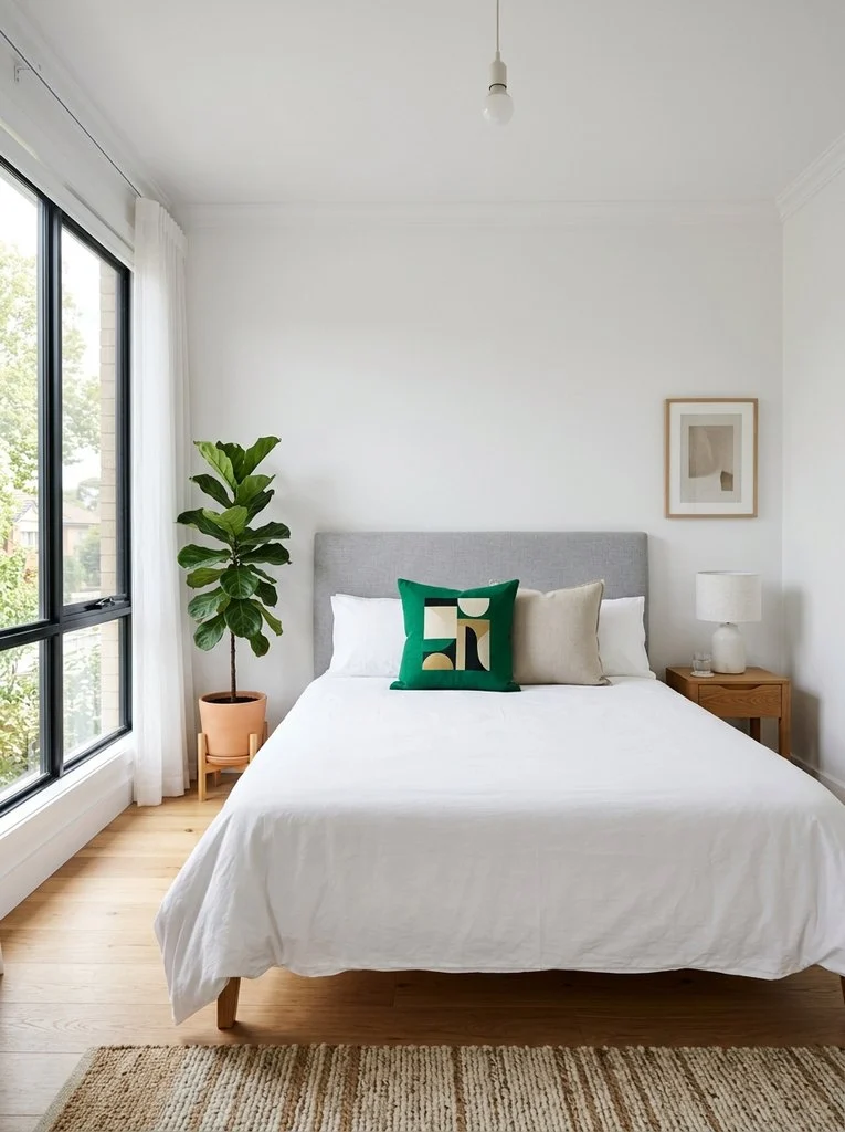
A single bold pillow can transform an otherwise simple bed. Choose one with a saturated color or graphic print against neutral sheets. This small addition draws the eye and adds personality instantly. However, one or two accent pillows work better than several competing prints. Additionally, this trick suits renters who want change without buying new bedding sets. It remains one of the easiest bed styling tips for quick seasonal updates.
6. Mix Vintage Prints with Modern Solids

Vintage floral or paisley prints pair surprisingly well with clean modern solids. This combination bridges old and new design sensibilities in one bed. A vintage-style duvet paired with crisp white sheets feels fresh rather than dated. Meanwhile, brass or wood accents in the room reinforce the mixed-era theme. This idea suits eclectic bedrooms that already blend furniture styles. The result feels collected over time, not overly matched.
7. Use a Color Wheel Approach for Coordinated Mixing
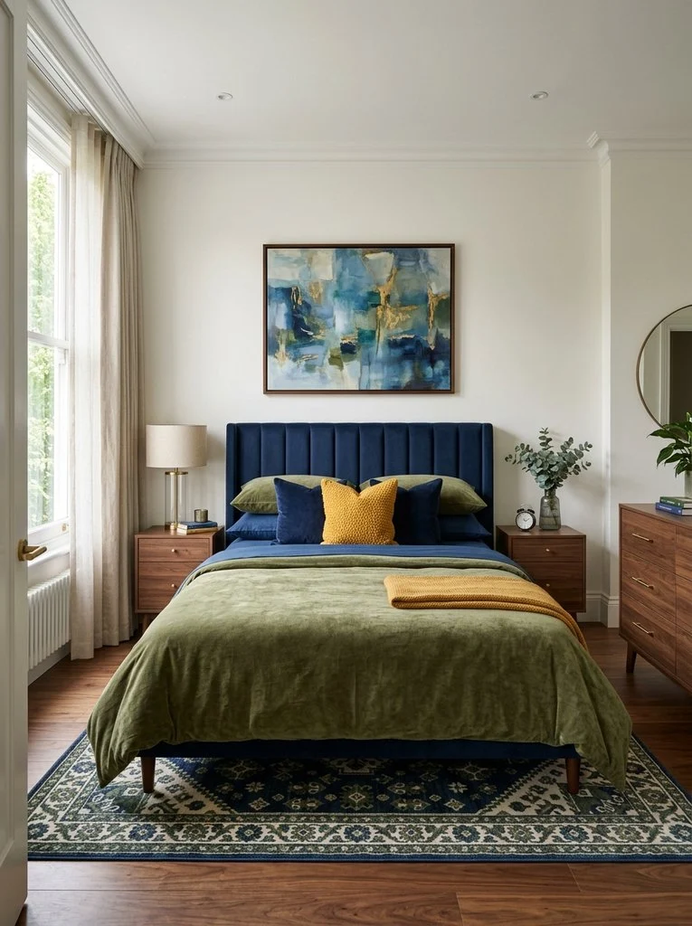
A color wheel simplifies choosing sheets that mix well together. Analogous colors, such as blue and green, blend smoothly on a bed. Complementary colors, like orange and blue, create energetic contrast instead. Choosing one dominant hue and one accent hue keeps the mix controlled. Additionally, this method removes guesswork from bedding color palette decisions. Even beginners can build a confident, coordinated bed using this simple tool.
8. Blend Linen Sheets with Cotton Pillowcases
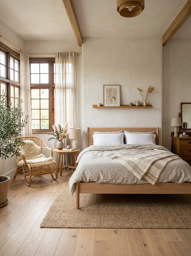
Linen sheets bring a relaxed, slightly wrinkled texture to the bed. Pairing them with crisp cotton pillowcases balances casual and polished elements. This mix suits those drawn to natural bedding textures and organic materials. Linen also breathes well, making it a practical choice for warmer climates. Meanwhile, cotton adds a cooling, smooth contrast near the face. Together, these materials create a bed that feels both lived-in and refined.
9. Try Tonal Layering Within One Color Family
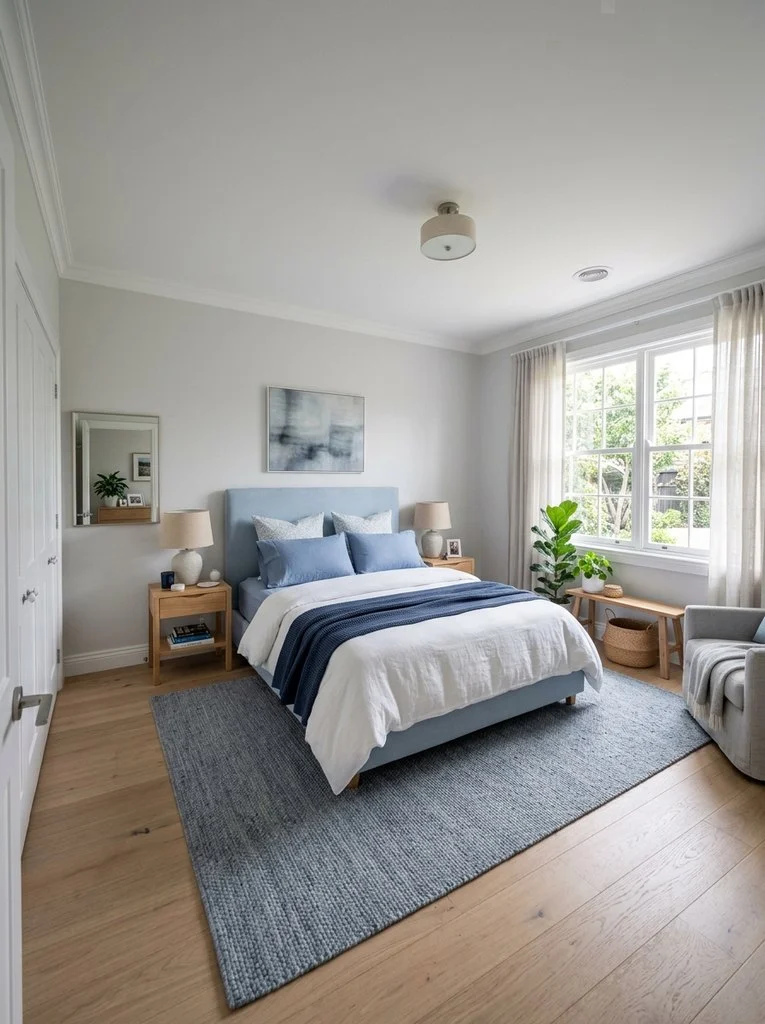
Tonal layering uses several shades of a single color across the bed. Light blue sheets, medium blue pillowcases, and a navy throw all work together. This approach feels sophisticated without requiring pattern knowledge. Additionally, tonal layering suits small bedrooms where busy patterns can feel overwhelming. Sage green, terracotta, and dusty rose all work well as base tones. The layered effect reads as intentional and calm rather than plain.
 You may also like20 DIY Christmas Earrings That Are Quick to Make
10. Mix Geometric Patterns with Organic Shapes
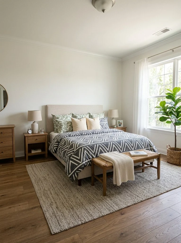
Geometric prints bring sharp lines and structure to a bed. Pairing them with organic shapes, such as leaves or waves, softens the overall look. This contrast keeps the eye moving without feeling disjointed. A geometric duvet with an organic-print pillow often strikes the right balance. Meanwhile, keeping both patterns within the same color family prevents visual competition. This combination suits modern and transitional bedrooms particularly well.
11. Pair Warm and Cool Tones Together
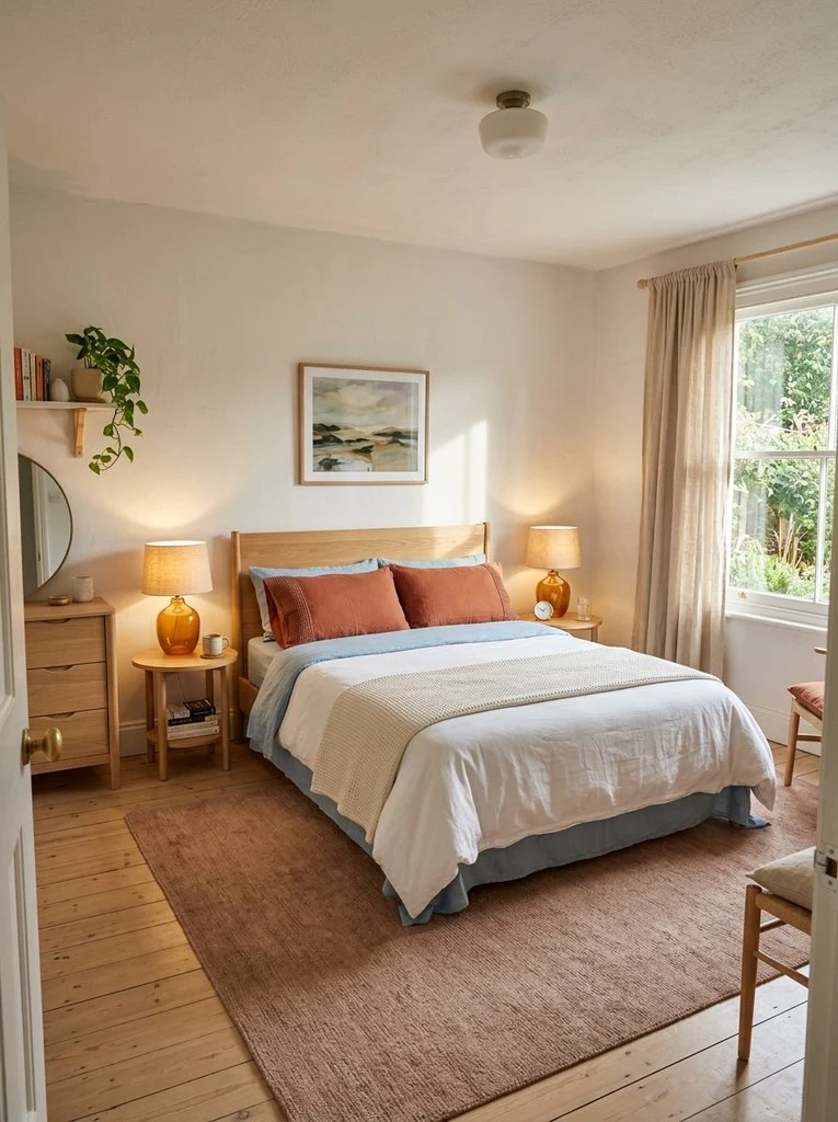
Warm and cool tones can coexist beautifully on one bed. Terracotta pillowcases against pale blue sheets create gentle, balanced contrast. This pairing borrows inspiration from green and cream color pairing approaches used elsewhere in the bedroom. The key lies in choosing one dominant temperature and using the other sparingly. As a result, the bed avoids feeling either too warm or too cold. This method works across nearly every design style.
12. Use a Statement Duvet with Simple Sheets
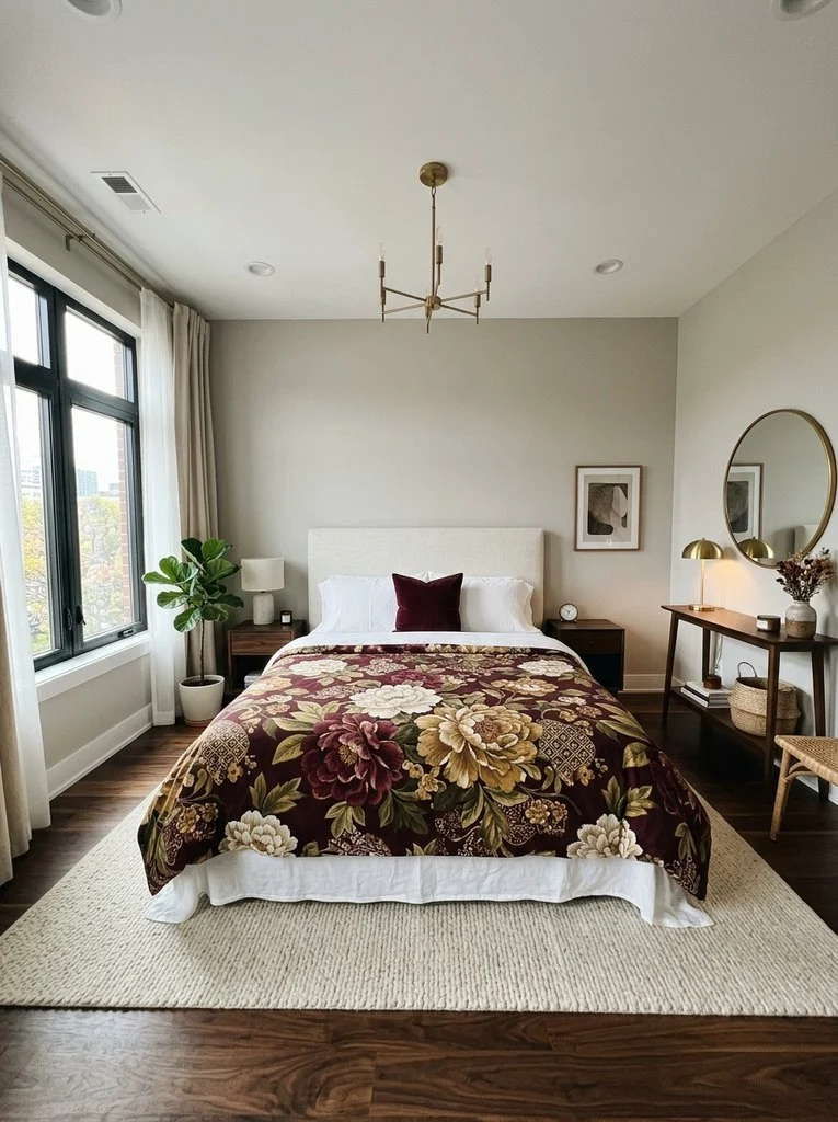
A statement duvet cover works best against understated sheets underneath. Bold colors, oversized florals, or graphic prints all qualify as statement pieces. Simple white or cream sheets let the duvet remain the focal point. Meanwhile, one or two coordinating pillows can tie the look together. This idea suits anyone hesitant to commit to a fully patterned bed. It offers maximum impact with minimal styling effort.
13. Mix Checked Patterns with Solid Pillowcases

Gingham or buffalo check patterns bring a cheerful, classic feel to bedding. Pairing checks with solid pillowcases in a matching color keeps the look grounded. This combination suits farmhouse, cottage, and traditional bedroom styles especially well. Additionally, a small check paired with a larger check in the same colorway adds subtle depth. The pattern feels playful without competing with other elements in the room. Simple pillowcases keep the overall bed from feeling too busy.
14. Layer Seasonal Textiles for Year-Round Versatility
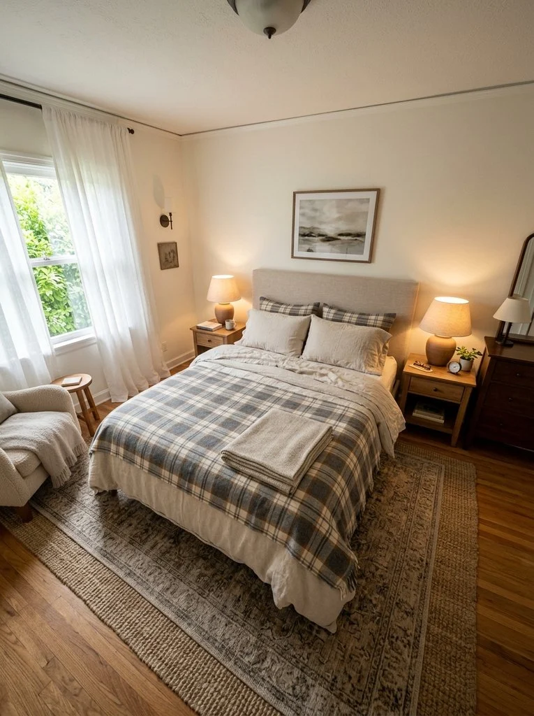
Seasonal layering keeps a bed adaptable throughout the year. Lightweight linen and cotton suit warmer months, while flannel and wool add winter warmth. Swapping a top layer, rather than the entire set, saves money and effort. Meanwhile, keeping a consistent base sheet color simplifies seasonal rotation. This idea suits practical households that want variety without constant repurchasing. Layered bedding also adds visual richness regardless of the season.
15. Combine Metallic Accents with Soft Fabrics

Metallic threads or trim add a subtle glamour to soft bedding fabrics. A gold-trimmed pillowcase against matte cotton sheets creates elegant contrast. This idea echoes styling seen in royal blue and gold bedding combinations for a richer bedroom feel. However, metallic accents work best in small doses to avoid overwhelming the space. A single metallic-edged throw or pillow often provides enough shimmer. This pairing suits glam and traditional bedroom styles.
16. Mix Boho Prints with Minimalist Bedding

Bohemian prints bring color and pattern that can feel intense alone. Balancing them with minimalist white or beige sheets tones down the intensity. This pairing keeps a boho bed from feeling cluttered or overwhelming. Meanwhile, natural materials like jute and rattan in the room reinforce the theme. A woven throw or macrame accent completes the layered look. This combination suits eclectic and bohemian bedrooms particularly well.
17. Pair Dark and Light Shades for Balance
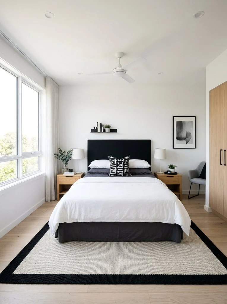
Contrasting dark and light shades create striking visual balance on a bed. Charcoal sheets under a white duvet feel crisp and modern. This idea shares similarities with light blue bedding ideas that pair pale tones against deeper accents. The dark and light split can run horizontally or through separate layers. Additionally, this pairing photographs beautifully due to its strong contrast. Most bedroom styles, from modern to traditional, can use this approach.
18. Use Complementary Colors for a Bedding Color Palette

Complementary colors sit opposite each other on the color wheel. Blue and orange, or purple and yellow, create energetic combinations when paired thoughtfully. Using one color as the dominant tone keeps the palette from feeling overwhelming. Meanwhile, muting one of the two colors softens the overall contrast. This approach suits bold bedrooms that want personality without chaos. A well-planned bedding color palette makes the whole room feel more cohesive.
19. Mix Textured Throws with Printed Sheets
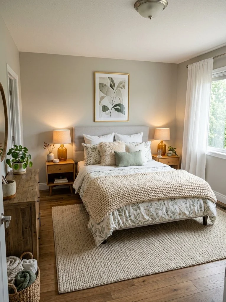
A textured throw adds dimension to an already patterned bed. Knit, boucle, or faux fur throws all work well over printed sheets. This combination keeps textured bedding from feeling flat or one-dimensional. Additionally, choosing a throw in a solid color from the print anchors the look. This idea works especially well in cooler months when extra layers feel practical. The finished bed feels cozy, rich, and thoughtfully assembled.
How to Choose a Color Palette for Mix and Match Sheets
Start with one dominant color that already exists in the room. Build outward using two or three supporting shades for balance. Neutral tones work as a safe base for bolder pattern choices. Meanwhile, warm and cool tones should stay in careful proportion to each other. Testing swatches on the actual bed helps confirm the final combination. A strong bedding color palette ties the whole bedroom together visually.
Common Mistakes to Avoid When Mixing Bedding
Overloading a bed with too many bold patterns creates visual chaos. Instead, limit statement prints to one or two pieces per bed. Ignoring texture is another common misstep in mixing patterns bedding successfully. Additionally, mismatched color temperatures can make a bed feel unbalanced. Skipping a cohesive color thread between pieces often weakens the overall look. Careful editing, rather than adding more, usually improves the final result.
FAQs About Mix and Match Sheets Ideas
Can different sheet brands be mixed together? Yes, different brands can mix well if colors and weights stay consistent.
How many patterns should one bed include? Two to three patterns usually create balance without feeling cluttered.
Do mixed sheets need to match the room decor? They should relate to the room’s palette, though exact matching is unnecessary.
What fabric mixes work best together? Cotton, linen, and percale blend easily due to similar weights and finishes.

Written by Stephanie Fallis
Mom and homemaker who shares budget friendly DIY projects, decorating tips and gardening ideas for busy families.
More about me → Christmas ideas21 DIY Christmas Cards That Are Fun to Make
 Christmas ideas22 Christmas Plants for a Festive Green Home
 Christmas ideas21 Farmhouse Christmas Decor Ideas: Simple and Rustic